
TrekAssist
Creating a Style Guide for E-Ink Devices Tailored for National Park Visitors
Role
UI/UX Designer
Design user flow
Define user persona
Prototype
Team
Shannon Chen (Designer)
Zhu Lyu (UX Researcher)
Micah Maiava (UX Researcher)
Duration
Nov - Dec 2023
4-week project
Skills
User Research
UI Design
What I did
As one of the designers on the team, I designed an electronic-ink device interface to help Yellowstone National Park visitors navigate safely, working within strict low-color constraints to conserve battery life.

Overview
This is a design challenge assigned in my Computer Interface Design class. We were tasked with creating a solar-powered e-ink device with color capabilities for guiding visitors at the Yellowstone National Park.
Goals
01
Design a battery-efficient, readable UI by using low-saturation colors with intentional pops of green/red for high-visibility while hiking.
02
Prioritize safety-critical actions by enlarging SOS/emergency controls and using full-screen, screen-freezing alerts to ensure immediate attention in emergencies
Problem Statement
How might we help park visitors have an up-to-date, accessible guide to the park without worrying about running out of battery?
Ideation
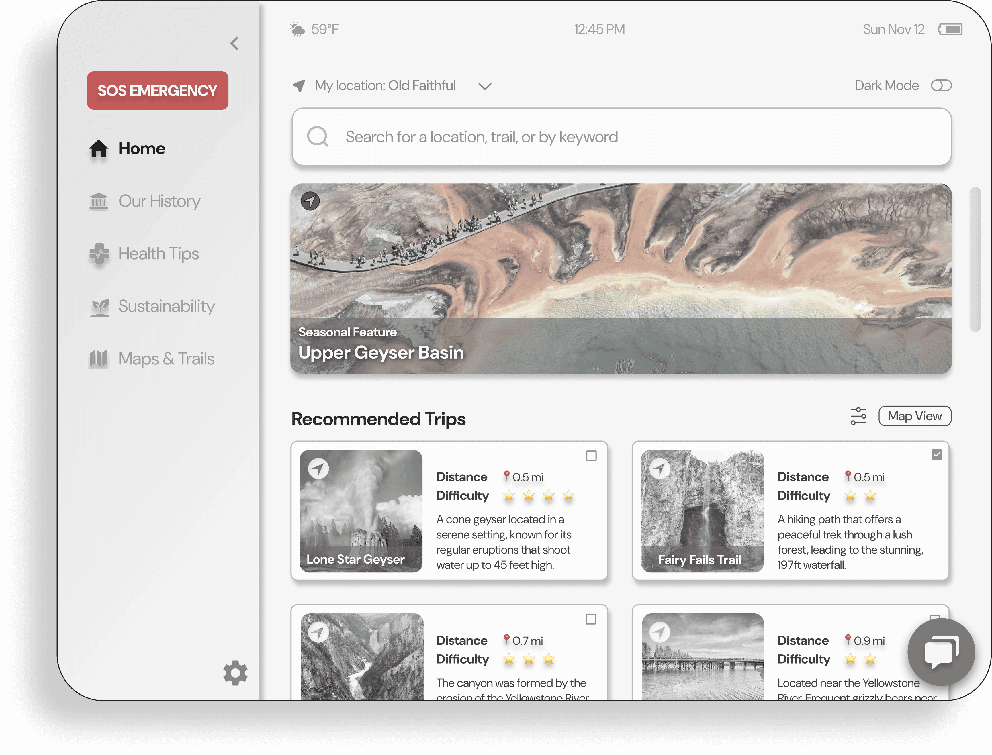
Users first select a language on the home screen, then follow brief in-app tutorials as they begin. Next, they reach a menu with four primary features: Weather & Wildlife Alerts, Chatbox, SOS, and Audio Guides. Because battery life is affected by weather and on-screen color usage, battery status is shown on every screen so users can monitor power at all times.
Sketches
We created a user-flow–driven concept for an informative e-ink guide that lets visitors explore Yellowstone locations and history, with built-in alerts, emergency help, and a chatbox for safety throughout the park.
Initial Design
The initial design concept incorporated vibrant colors to enhance user engagement and visual appeal. We also included special features like dark and light modes for optimal device operation during nighttime and daytime.
Usability Testing
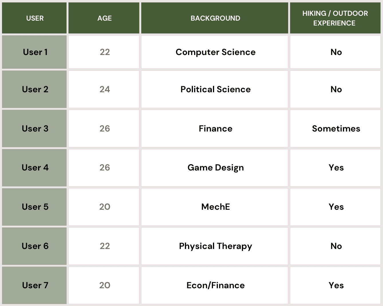
The usability testing aimed to assess the TrekAssist National Park Guide interface with a focus on user interaction, navigation, and satisfaction. Participants' demographics varied, including interests and academic backgrounds.
User Tasks
-Language Selection
-Navigation
-Use the Dual Screen Mode
-Information Exploration
-Navigating in Settings
-Using the Emergency Assistance
User Feedback
Enhance the display of the language selection button.
Before
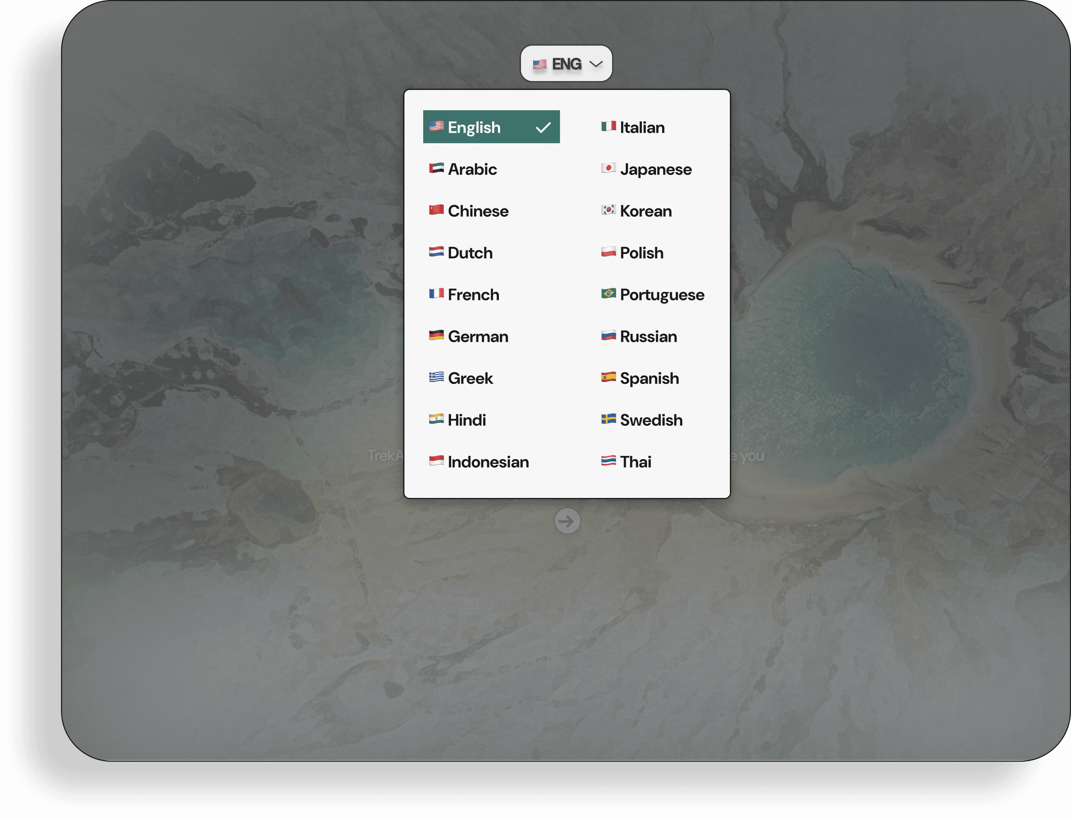
After

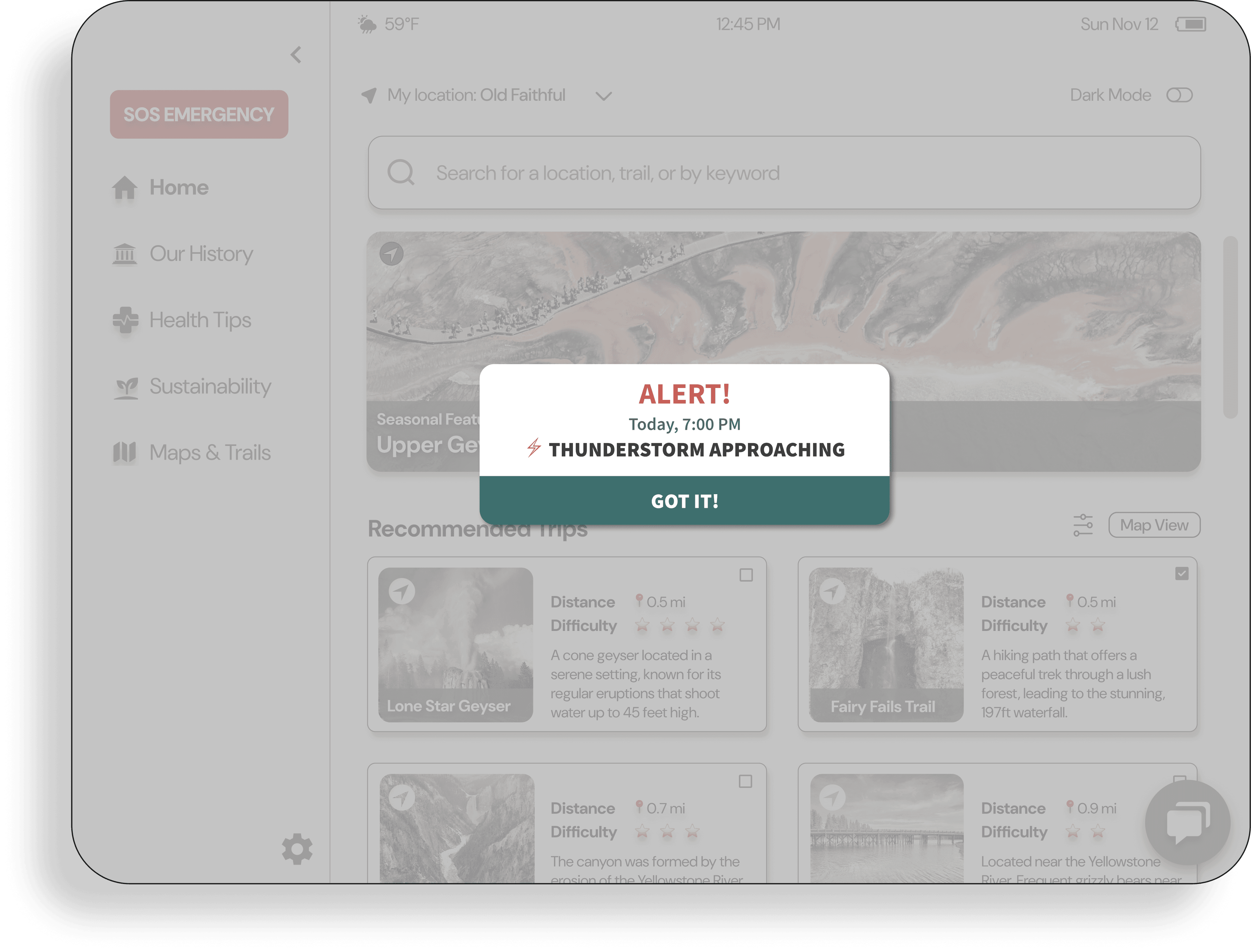
Improve visibility of alerts: dim the background & adjust visual elements.
Before

After
Increased color usage drains battery faster so use more black and white.
Before

After
Style Guide
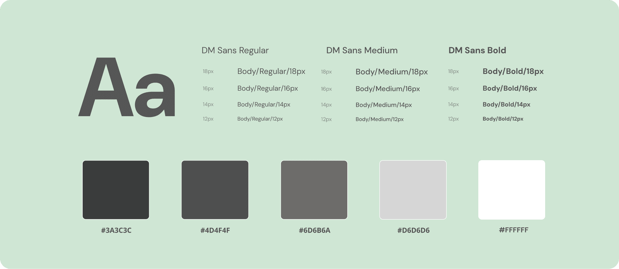
We chose DM Sans for its clean, highly legible letterforms that stay readable across screen sizes, which is important for hikers using an e-ink device. We also used a low-saturation grayscale palette to maximize contrast and visibility within the device’s constraints.
Final Design
Here’s a video of the final prototype I designed for this project.
Alert Systems & Dark Mode
Users are equipped with emergency alert systems within the park environment, as well as the option to enable dark mode for their screen preferences.

Sustainability & Health Tips
Offering sustainable and health-conscious tips to assist users as they explore the trails of Yellowstone National Park. Also provides essential guidance for handling emergencies.

Maps & Chatbox
The map displays routes for navigating the park's terrain seamlessly. Moreover, a Chatbox system is available for users to seek assistance or engage in interactive support.
Filter & Our History
Plan faster with filters that sort trips by distance, rating, expiration, and friends’ connections, and explore Yellowstone’s history through a curated history page.
Learnings
Contact
Tel: +1 (857)488-8411
Email: yejune.cho7@gmail.com
Thank you for taking the time to view my designs!